Front cover...

Contents psge...

Double Page Spread...

 To start off my double page spread I had to go into page setup to make sure that the paper was landscape. Before writing my interview onto photoshop I typed it up on Microsoft word first to make sure that all the spellings were right and also to make sure I read it properly before adding to my double page spread. I used the type tool to get it all in line with each other by keep changing the part in which I was writing it. This way it was easier to get all the lines at the same length. I wrote the questions in black and the answers in pink, therefore the reader will be able to tell the difference between the two. I decided that I wanted the double page spread to have a black and pink colour theme, so as the interview are in these colours I also did the title in the same pink as 'Lottie Piper's' answers.
 To finish off the double page spread I added in two of the quotes from the interview and put them into a bold pink circle. This will then catch the readers eye and they would read these first. By choosing these quotes, I was thinking that straight away the reader would read them and as they are things that a pop star does and what every young girl does, they will then want to read on.
 After looking at many different music magazines I decided that I would include, in my contents page a note from the editor. Therefore this is what I added to the blank A4 page first. I then added the 'What's inside'. As my target audience is for younger readers I thought that by saying whats inside other than contents, they would understand it better and it is more child like. I carried on the same colour for whats inside from the masthead, this is so that is linked together and it looks like it has come from the same magazine. The way in which i wrote the note from the editor, I aimed it to have friendly language as if the reader and I were friends.
I then the pages in which is going to be inside my magazine. I did a section for the things that are regulars within the magazine and then I did another one in which it contained the things that had been added into the magazine for that weeks copy.

In this stage I carried on the theme of the rainbow and placed it into the corner on a slant. Therefore I could then make it smaller and easier to place when there was not that much room left on the page, as I still needed to add some images. I also placed a yellow box around the 'What's inside' and then pink boxes around the editors note, 'regulars' and 'features'. This then contrasts it in with the colour scheme of the rainbow, like the front cover.


My original design for the front cover of my magazine was to have the masthead written trough a rainbow and after trying it out I then decided that it did not look right for a music magazine, as I still wanted to include the rainbow within the front cover, I decided to put it behind the main image, therefore it is still there but is not the first thing that the reader/buyer would look at.
Stage three... I next added on the tag-lines for the magazine. The headline story 'Lottie Piper...' I made sure that i used a bigger boldre font than the rest of the taglines, so that the reader will know that this is going to be the main story within my magazine and the image is of Lottie Piper. As I kept the rainbow within the front cover I decided to use the colours from it to get the colours of the tag-lines. I believe that this then does not make the rainbow look so random and it all contrasts in with each other.
Final stage...
 I finally added the barcode, the line at the bottom which tells the reader what other pop bands/singers they can find inside the magazine and then I also added in the date of week that the magzine would be sold and the price.


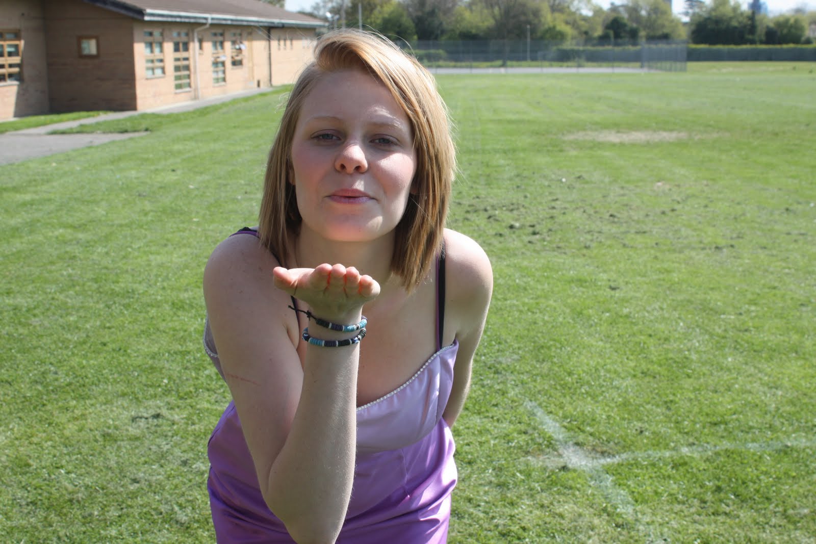
I like this image but i think that it would be quite hard to be able to put it onto a front cover without it looking quite strange. Also i do not think that it would be suitable for a pop magazine.
These are a few images out of many that i took for my front cover. However these ones are my favourite and i will choose one of them for my main image, i will edit them so that the lighting is better and that they are on a better background.


