Monday, 3 May 2010

Coursework Evaluation

1. In what way does your media product use, develop or challenge forms and conventions of real media products?


From analysing music magazines at the beginning of the coursework, this helped me to decide how i was going to design my front cover, contents page and double page spread. I was then able to identify elements that were used in most magazine. E.g. Tag-lines. And then also the elements that were original and that linked together the magazine. E.g. colour themes. I started off my magazine front cover with a picture in mind of how I wanted it to look unconventional, however as I started to put it together like this, I soon realised that would not have worked and that i was better off to stay as making it conventional. I had my own titles and photo ideas and the other magazines helped me to decide which ones I wanted to use in my final, I could
then get the most out of my magazine for it to look professional and suitable to sell on a shop shelf. As there is not many pop music magazines around, I couldn't really look at any to help me whilst designing my music magazine. In the front cover I used the conventional things like mastheads, taglines, barcodes and an eye catching main image, I also made sure that the front cover included the price and date in which it would be sold. The main headline on the front cover, is bold and bright and therefore it would be obvious to the reader that that is going to be one of the main stories in the magazine.
I started off my music magazine after designing three different front covers, using my masthead as 'Pop Princess' and this was written through a rainbow, after I had started to produce the front cover I decided that it was not working as if it was to be sold this way from far back Pop Princess could not be read and with the rest of the images etc on the front cover, the rainbow was too over powering, this is why I completely changed the name of my magazine and the way in which I laid it out. I changed the name from Pop Princess to Popular because I felt that it looked and sounded immature and too young.


Within the double page spread, I wrote it as an interview like most magzines do and also added images and picked out quotes and made them stand out, this is like many double page spreads that I had looked at before starting the coursework.
My final contents page, in some ways followed a conventional contents page, I have a bit which says 'Regulars' and 'Features', I have also used the same rainbow that is on the front cover in the contents page but made it a little bit smaller.
I also put a little version of the front cover into the contents page at the bottom of the editors note. By including all these ideas I was able to develop and challenge forms and conventions of real media products, to then fit my own design.

2. How does your media product represent particular social groups?

I have aimed my music magazine at young teenage girls, aged between 12-14 years old.
For my music magazine I chose a model that would suit the theme of pop music and that fitted in well with my target audience. When putting together my magazine I wanted my 'celebrities' (models) to be a good role model for the target audience of young girls and who like to listen to this type of music. I chose my 'popstar' on my double page spread to be the same image on my front cover, this is because she is young and attractive and this would attract young girls to buy the magazine. My music magazine represents the social group of young girls like Samantha who I used in my target audience profile. My magazine represents young girls in a positive way, as it is colourful and fun that will attract the audience to the appearance and and standard of my product. I didn't use anybody that was too young as my model or one that was too much older than my target audience. This is because this type of magazine is not aimed to anyone of them ages and therefore they would not purchase the magzine from the shelf in a shop. The typeography that I included within my magazine was quite simple and easy to read, this will also attract a younger reader, as anything that is too complicated they would not bother to look at, this is also the same with the colours I used, there are many different colours and they are all bright and eye catching.

3. What kind of media institution might distribute your media product and why?

One company that could publish and distribute my magazine could be the bbc. http://www.bbcmagazines.com/. The BBC media however sell a large range of music magazines and one of them is extremely popular. 'Top of the Pops'. This could be a problem for my magazine to be published by them because they would not want it competing with their big magazine as mine is also under the pop genre.

Another company that may publish my magazine could be IPC media: http://www.ipcmedia.com/. They have published 80 successful magazines, like NME. They also haave nearly two thirds of the public that buy their magazines are female. This is good becuase it is young girls that my magazine is aimed at. Although they produce a range of many different magazines they do not produce Pop magazines therefore by producing my magazine, it would give them more scope.

That is two companies that could produce my magazine. Places that could distribute my magazine are big well known shops like Tescos and WhSmiths. These would be good places that could distribute my magazine because as my magazine is not yet known by many people and by selling it in a well known shop, will help to sell the product.
Another way in which my magazine could be distributed is by mail and suscription, that way as it is aimed at younger teens it is easier for them to get the magazine and also as it is sold weekly it will be easier than having to go to a shop every week.
Some magazines are sold at magazine kiosks. However I do not think that a magazine kiosk would distribute my music magazine as they do not always sell music magazines as they prefer to sell magazines that they know will sell, like 'Heat'. As many people buy magazines for celebrity gossip.


4. Who would be the audience for your media product?


The audience for my music magazine is young girls that age between 12-14 year olds. Like Samantha, the girl that I used in the audience profile, they should be interested in pop music, being with their friends and having girly nights in with chocolate ice-cream. They should also be interested in singers like, Pixie Lott, Katy Perry and Leona Lewis. Without this taste in music there would not be much point in buying my magazine therefore the young girls that do, my magazine will really suit them. As it is aimed at young teens and they are likely to have no money as they are too young to earn it themselves I have priced my magazine to retail at £2.00.


5. How did you attract/address your audience?

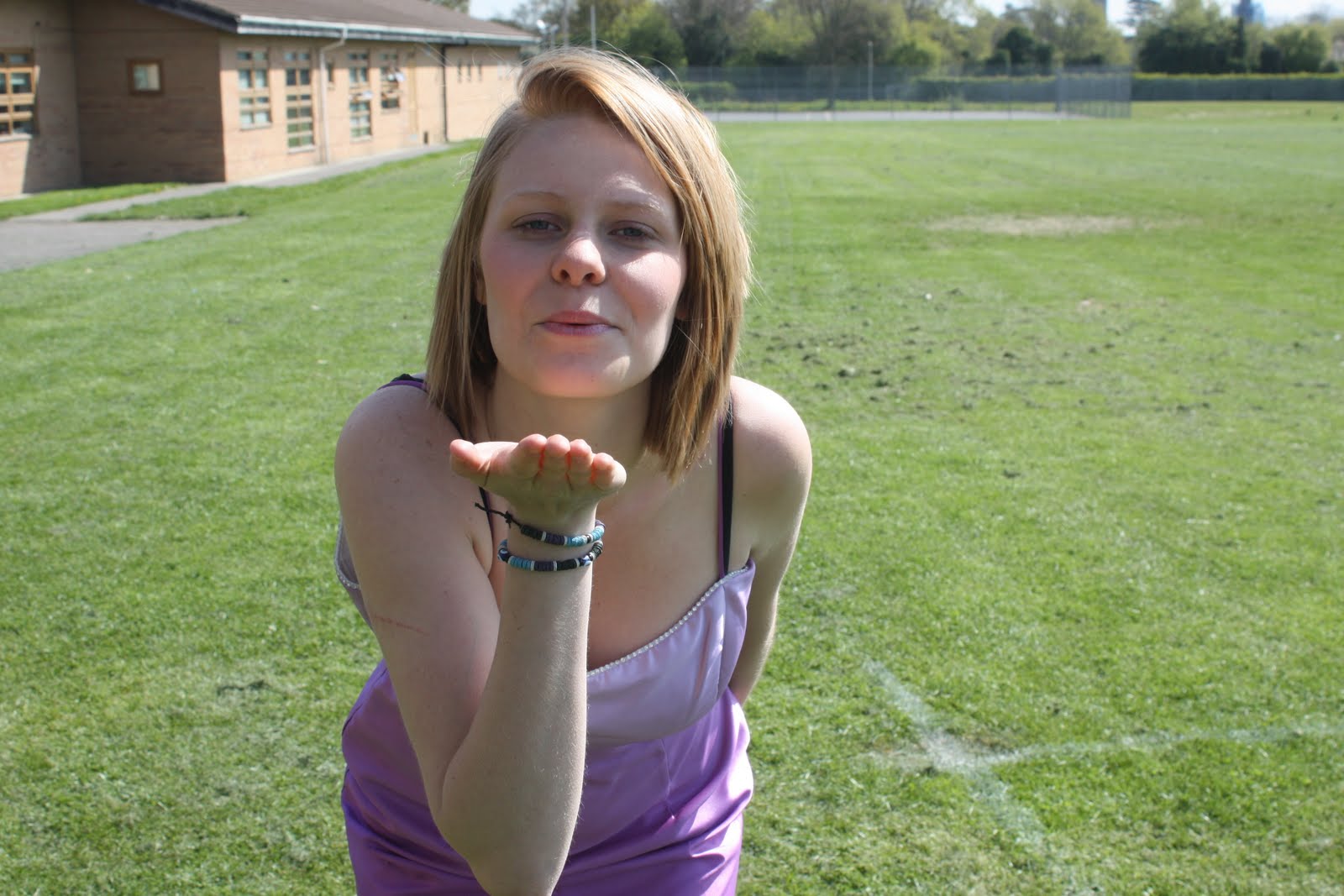
Mise-en-scene is also a big part in designing a magazine, so that it attracts an audience. I have tried to attract an audience by using many different techniques. I used images of a model-like girl, who represented my target audience of teenage girls. The model I used, Charlotte 'Lottie Piper' has a young attractive face with a slim build and this will attract young girls as they will want to be like her. I dressed Charlotte in a light purple prom dress, this is because young girls love a girly dress and cannot wait for the day of their prom. I also made sure that she was not wearing too much make-up as young teens shouldnot be persuaded by looking at a magazine to wear a lot of it.


I chose the colour scheme by taking the colours out of the rainbow and using the different colours to do the different things like, the background and taglines. I did this because they are bright colours and by using lots of different colours, it can start to have a pretty, girly appearance. Also straight away when somebody thinks 'girly' they think pinks, purples, whites etc, so I wanted my magazine to be different. The language that I used was informal throughout my magazine as it then portrays the magazine as friendly, this will attract youn girls and they would want to read on.
By deciding that my magazine would be retailed at £2.00, this will also help to attract my audience as that is not that expensive for a music magazine and they are not old enough to be able to afford a magazine every week that is too expensive.
All the articles that have been included on my front cover are what every young girl wants 'luscious locks' or love doing 'girly nights in'. This is another way in which my magazine will attract young teens to want to buy my magazine.

6. What have you learnt about technologies from the process of constructing this product?

To create my music magazine I used Photoshop Elements 8, I used the same photoshop when completing my preliminary tast, however I only knew how to use the basic tools like cropping the image and cutting it out with the lasso tool. Now after completing my final products I have learnt new skills on how to use it and what majority of the tools mean and do. I completed my music magazine on a Apple Mac computer, when doing the preliminary I found it difficult to use, however when starting my final magazine I was used to how it worked. On photoshop I now understand how the layers work and what I have to do to get images under/over the masthead etc. Some of the tools that I have learnt to use properly are the 'move tool', 'clone stamp tool', the 'eraser tool', the 'shape tool' and the 'gradient tool'. I also learnt how to add and arrange layers and how to use some of the basic tools like text and how to change the canvas size.


The camera that I used to take my photos was a Cannon 400. Before taking the photos for my music magazine, I decided to take them outside so that the images would be brighter, I had to take into consideration the sun light. I had to make sure that the sun was behind me, whilst I was taking the photos and then had to double check that the sun was not making Charlotte's (model) face not too bright so that when I took the image you could see her face properly. I wasnt a hundred percent sure if I was going to use the background that I took the image on or whether I was going to cut it out, I tried with the background and decided that a field type background did not contrast in with the style of the front cover.

As well as photoshop and a camera I also used http://www.blogger.com/ to show the stages throughout my work from the start to the end and also to upload the images of my work, I have also used it to show the research and analysis that I did before designing my final product.

7. Looking back at your preliminary task, what do you feel you have learnt in the progression from it to the full product?

For my preliminary task I designed a front cover and contents page for a school magazine. At the beginning I looked at some previous school magazines to help me with ideas for my versions. I planned a few mastheads, tag lines and what sort of images I had in mind to use. I ended up having to produce 3 different copies of my front cover and contents page because photoshop kept crashing and as I hadnt saved my work any where else other than my memory stick it was deleted. Therefore througout this task I have learnt that I need to make atleast 3 copies of my work. My preliminary did not have any conventions to it, this is because I did no research before completing it. When using photoshop to complete my preliminary coursework I only used basic tools and can see that now my knowledge on how photoshop works is more improved. I think my music magazine looks of a higher quality and more professional than my school one. My music magazine was aimed at a certain audience and was completed after a lot of research whereas the school magazine wasn't. When completing the preliminary task I did not really know how to use photoshop, however when I came to do my final pieces I was able to use it better and knew how to use the layers properly to give my magazine a professional and retail look.


Wednesday, 28 April 2010

Final

Front cover...


Contents psge...

Double Page Spread...


Stages of Double Page Spread

Stage one...
To start off my double page spread I had to go into page setup to make sure that the paper was landscape. Before writing my interview onto photoshop I typed it up on Microsoft word first to make sure that all the spellings were right and also to make sure I read it properly before adding to my double page spread. I used the type tool to get it all in line with each other by keep changing the part in which I was writing it. This way it was easier to get all the lines at the same length. I wrote the questions in black and the answers in pink, therefore the reader will be able to tell the difference between the two. I decided that I wanted the double page spread to have a black and pink colour theme, so as the interview are in these colours I also did the title in the same pink as 'Lottie Piper's' answers.


Stage two...

I next added in the two images into each corner. I used the one of her blowing a kiss because it would be portrayed as friendly to the reader and then by using the one of her resting her head in her hands, I was trying to get the effect of a girly girl who is sweet and innocent, a bit like maybe the person who was going to read the magazine would be like.
Last stage...

To finish off the double page spread I added in two of the quotes from the interview and put them into a bold pink circle. This will then catch the readers eye and they would read these first. By choosing these quotes, I was thinking that straight away the reader would read them and as they are things that a pop star does and what every young girl does, they will then want to read on.

Stages of contents page


Stage one...
After looking at many different music magazines I decided that I would include, in my contents page a note from the editor. Therefore this is what I added to the blank A4 page first. I then added the 'What's inside'. As my target audience is for younger readers I thought that by saying whats inside other than contents, they would understand it better and it is more child like. I carried on the same colour for whats inside from the masthead, this is so that is linked together and it looks like it has come from the same magazine. The way in which i wrote the note from the editor, I aimed it to have friendly language as if the reader and I were friends.  


Stage two...


I then the pages in which is going to be inside my magazine. I did a section for the things that are regulars within the magazine and then I did another one in which it contained the things that had been added into the magazine for that weeks copy.


Stage 3....


In this stage I carried on the theme of the rainbow and placed it into the corner on a slant. Therefore I could then make it smaller and easier to place when there was not that much room left on the page, as I still needed to add some images. I also placed a yellow box around the 'What's inside' and then pink boxes around the editors note, 'regulars' and 'features'. This then contrasts it in with the colour scheme of the rainbow, like the front cover.


Last stage...

I finished the contents page off, just by adding in some images of the main story within the magazine. (Lottie Piper). That way the reader knows that that version of the magazine is based around her.

Stages of front cover

Stage one...


I chose this image because she is smiling and portrays the magazine as friendly and welcoming to a young buyer. I edited this picture as she was sitting on a field before and this would not have fitted in with the type or colours of the front cover. I then opened up a new A4 page and that is where I proceeded to copy the image onto it, where i then added the masthead, which is written in the font type 'Calibri'. I changed the size of the image so that it fitted well onto the page and was big enough to be seen but not too big so that there was no room for the masthead or tag-lines. After I had the image and the masthead situated in the right place I chose a light yellow for the background as it contrasts well with the purple dress and pink lettering of the masthead. Just inbetween her arm and her body, after i had cut it out with the 'lasso tool' there was still a little bit of the field from the field background. Therefore I then used the eraser tool to rub it out and filled it in with the same yellow background.


Stage two...


My original design for the front cover of my magazine was to have the masthead written trough a rainbow and after trying it out I then decided that it did not look right for a music magazine, as I still wanted to include the rainbow within the front cover, I decided to put it behind the main image, therefore it is still there but is not the first thing that the reader/buyer would look at.

Stage three...

I next added on the tag-lines for the magazine. The headline story 'Lottie Piper...' I made sure that i used a bigger boldre font than the rest of the taglines, so that the reader will know that this is going to be the main story within my magazine and the image is of Lottie Piper. As I kept the rainbow within the front cover I decided to use the colours from it to get the colours of the tag-lines. I believe that this then does not make the rainbow look so random and it all contrasts in with each other.


Final stage...

I finally added the barcode, the line at the bottom which tells the reader what other pop bands/singers they can find inside the magazine and then I also added in the date of week that the magzine would be sold and the price.

Final photos after editing

This is the image I started with before I edited it...

This is what the image looked like after editing.

Images for front cover - before editing


I like this image because by her blowing a kiss and looking into the camera, makes it look quite welcoming and friendly. The only thing i dislike about this photo is that some of her face is lighter than the rest of her face. Also it might not be very suitable for the front cover image of a pop music magazine.


I really like this image because if it was on the front cover it would make the magazine look extremely welcoming and friendly. It might be hard to cut her out of the background because the sun is shining on her hair and it is contrasting in with the sky.


I like this image but i think that it would be quite hard to be able to put it onto a front cover without it looking quite strange. Also i do not think that it would be suitable for a pop magazine.


These are a few images out of many that i took for my front cover. However these ones are my favourite and i will choose one of them for my main image, i will edit them so that the lighting is better and that they are on a better background.

Double page spread sketches


Contents page sketches


Front cover sketches


Questionnaire results

I posted a questionnaire on my blog to find out what my target audience liked and wanted out of a music magazine. People visited my blog to answer my questionnaire and with the results i am going to give an overall analysis of them. This will then help to come up with the final ideas for my music magazine.

Are you male or female?

The majority of the people that answered this question were female therefore this helps me to see that i will aim my magazine mostly at females.

What age category do you fit into?

83% of the people that answered my questionnaire were between the ages of 15- 18. And then there was 16% of 14 and younger, this has helped me to decide that i will design a music magazine for 14 years and younger as maybe if there was more of a range of music magazine for that age range to read then the might buy one more often.

How often do you buy a magazine?

66% of the people that answered my questionnaire said that they bought a magazine one every so often, 16% said once a month and another 16% said once every 2 weeks.

How much do you pay for a music magazine?

60% of people pay £2-£3 for a music magazine, 20% pay £1-£2 and 20% pay £3-£4. Therefore I will be aiming to sell my music magazine for between £2-£3.
What do you look for in a magzine?
40% of the people that answered this question said that they look for true stories whereas the other 60% said thay look for interviews, therefore i will include some sort of interview in my music magazine.
How do you listen to music?
20% of people answered the internet whilst another 20% said they used their phone to listen to music. 60% said that they used an ipod to listen to their music. Therefore i could think about adding in maybe a competition within my magazine to win an ipod or along those lines.

Tuesday, 16 March 2010

Different Fonts For My Title

Pop Princess

Pop Princess

Pop Princess

Pop Princess

Pop Princess

Pop Princess

I have chosen 6 different styles and fonts for the title of my front cover. I cut down to two of the styles and I am going to use them both and see which one suits best for my target audience. I am going to do this by making a questionnaire and see my results and see which one turns out more popular.

Thursday, 11 March 2010

Target Audience


This is Samantha and she is a typical candidate of my target audience for my music magazine. She is 13 years old, lives in South Hertfordshire. Some of her hobbies are dancing, shopping and having girly nights in with her friends with a film, a tub of 'Ben n Jerry's' ice cream and some chocolate. At the weekend and in her free time she likes to go out socializing with her girly friends and going out for meals and then to the cinema to watch a film. Her favourite films are Angus Thongs and Perfect Snogging, Mean Girls and Seventeen Again. When Samantha has free time to herself at home she likes to watching the Disney Channel, which includes watching programmes like Hannah Montanna and 'Thats so Raven'. She also likes to watch Hollyoaks and Eastenders. 
Her favourite places to shop are New Look, River Island and Tammy. Samantha dresses like a young, typical teenager, skinny jeans and ugg boots. She does however like designer clothes but as she is in education she can not afford to buy them and just adds them to her wish list on the different websites. She listens to mainly to pop music however she does like the odd RnB, Hip Hop song and she doesn't like Rock or classical music. 
Some of the artists that she listens to are Leona Lewis, Britney Spears and Pixie Lott.

Friday, 5 March 2010

Maslow's Hierarchy of Needs


Maslow's hierarchy of needs is more often than not conveyed in the shape of a pyramid. It has the lowest but largest level of needs at the bottom and the need of self actualization at the top, also the needs for people.
This theory was created by Abraham Maslow.
The bottom of the pyramid is the things that people need and can not survive with out, however as it gets higher it turns from needs to wants and at the very top it turns to luxuries.
This theory can be associated with media products because a magazine would be at the very top as a luxury item as people do not need one to be able to survive.

Analysis of third contents page

Kerrang has quite a plain contents page, even though it has got a lot of going on and is very busy. It is also laid out in a simple way that the reader will find easy to follow. Many images have been used on this page however so that it does not seem too overcrowded they have all been separated by being put in their own individual box on the page. This will then attract the reader to each individual image, this even includes the main image. Adding to this effect their are eight smaller images surrounding the larger/main image, in effect of framing all the images, it indicates that the larger image is the main sell line of the magazine.
The masthead is situated at the top right hand corner "Contents" with a black background, this then contrasts with the rest of the text being on a white background. Yellow text has been used through out this contents page so that it stands out. The font styles used on the contents page are bold and simple. Again yellow has been used for the subtitles on a black background, this will stand out to the reader more than the small print and will persuade them to read on.
This contents page has been split up into different sub headings, these include: news, live reviews, K! icons, feedback, features, gigs, swag, album reviews and famous last words.
Many conventional magazine contents pages have a little note from the editor, the type of language that has been used in the little note on this contents page is informal and chatty, this will attract the readers because it relates to their target audience and will reach the consumers on a more personal level. It also will connect with them. By the editor signing their name at the bottom, this builds up a sort of friendship with the reader. Overall this will all make the magazine come across friendly and welcoming.

Friday, 26 February 2010

Analysis of Second contents page

For my analysis of a second contents page i have chosen to do this one which is one of three out of the music magazine Vibe. The masthead of this content page will stand out to the reader as it in in white capital letters against a black background, it then contrasts well together. It also almost uses enjabment however it doesn't have a meaning as the word 'contents' is not usually broken up into 3 syllables. This then gives off a sense of confusion, which then coincides with that fact that the reader could also be confused on why Ciara is laying upside down.
To help the audience know that Ciara is going to be the main feature of the magazine it is important that she fits in well with the colour therefore what she is wearing and the colour of it contrasts well with the colour of the background. This also represents her sexual, seductive image as one of the main first things that will catch the readers eye is her bare flesh.
The position in which she is laying with her legs in the air also adds to her sexual image and the way she is staring at the reader is also quite seductive. This image will attract both men and women as Ciara is someone that women will admire and she will attract men because of her good looks and the way in which she is laying.
Where her clothes blend in with the background so does the colour of her jewellery, this then makes her flesh stand out more and this will attract the customers eye. Although Ciara is the main image her legs have been made to be more obvious than the rest of her as they have been highlighted.
At the top of the page the letter "v" has been put into the contents page, this represents "Vibe" and as it is white, it contrasts with the background, Ciara's feet then fit in the shape of the letter helping it to be noticed more.

Analysis of third double page spread


This double page spread is from the magazine Q. The main theme for this double page spread is the established image of Pink. As this image is a close up of Pinks face, makes it obvious to the reader that that is who the text is going to be about. Also as she has a wide smile, this conveys her as being friendly and welcoming and would therefore attract the readers to want to read on. This is not usually how we think of Pink as usually she is portrayed as being quite rocky and 'hard'. This image would also catch the readers eye when flicking through the magazine.

Tuesday, 23 February 2010

Analysis of second double page spread

This double page spread is quite plain but would still catch the readers eye. Straight away by placing a catchy quote from the text, it will persuade the reader to want to read on. Lily Allen's name has been written in the same style as the title, this may help to link her with the quote/title. 
As the background is white and is not cluttered with lots of pictures and other bits of text, all the readers attention will be on the image and the text. The picture of Lily is covering the whole of the right hand side of the double page spread, by having such a large image, this will then stand out to the readers if they are just quickly flicking through the magazine before buying it. 
The colours of Lily Allen's clothes go well with the type of title as it looks like it may have been cut out of a magazine/newspaper and it also looks quite masculine, which is the same as the top that she is wearing. The way in which she is standing with her hands on her hips portrays her as maybe someone with attitude. Her tattoo can be seen with the way in which her wrists are pointing up. This shows her to be a little bit rebellious. She is conveyed as having a strong personality by looking straight at the reader.


Tuesday, 2 February 2010

Analysis of Double Page Spread

This is a double page spread from the magazine Top Of The Pops. Like the rest of the magazine it is brightly coloured and lots of different types and sizes of font have been used.
As the main image is of the Jonas Brothers this will attract many consumers, more so girls as Jonas Brothers are popular with female teens. Also the smaller images of the other characters are the right size so that they can be seen to be smiling, this makes the page come across friendly and will make people want to read about it.
This double page spread has been laid out with the image on one side and the text on the other where as some magazines on double page spread have the image overlapping both pages. This then makes this double page spread unconventional.
Where there has been a quote taken out of the text and put into a circle that will stand out, the readers are likely to read that first and then decide whether they want to read on, therefore this would be the case with this one as it is quite a catchy quote that people would want to know more about. Also the colours that have been used through out these two pages are bright, vibrant and quite eye catching and will therefore also attract the reader to read what has been written in the text not just looking at the pictures.

Friday, 29 January 2010

Analysis of front cover 3

For my third analysis of a magazine front cover i chose to do Q.
The colours that have been used are mostly black, red and white. Red is an ambiguous colour as it can mean sexy, loveor anger. Black can also be quite a sexy colour but also a bit gothic and by using white it is a complete contrast with the black and it help things to stand out.
The images and words all have a similar colour theme going on. This helps to tie it all together. The three lines of the main title have all been written in a different style, this will help to make the front cover eye catching.
With a close up of Cheryl Cole being the main image will attract the consumers because she is a well known celebrity, that a lot of people admire, due to her personality and beauty. However this picture is quite seductive people would want to know why she is on the front of this magazine looking like that.
This whole front cover with its colours, the way that Cheryl is licking her ring and her red lips comes across very sexy and seductive. With her skin being quite pale, this helps to show off her features.
The word 'ROCKS' is in large bright red writing and this will convey to the reader that this magazine has mainly a rock genre. Where it says 'THE UK'S BIGGEST MUSIC MAGAZINE' this portrays the magazine as well known and people will want to buy a magazine that is the best in the UK. This magazine front cover gets away with only having one image on the front cover because it is big bold it can still be seen on the shelf.
This magazine is very appealing due to the different style of Cheryl Cole and with such a big eye catching picture it makes you want to know what other pictures etc will be inside the magazine.

Analysis of front cover 2

The second magazine front cover i chose to analyse is called Blender. By looking at the colours that have been used it comes across as the magazine might be aimed mainly at girls/women. The same type of font has been used throughout this front cover, however they have just changed the colours of it, whether it is bold or not and the size of the font.
With the main and only image on this front cover being of Katy Perry this has been made obvious to the consumer if they do not know it is her by putting her name with the biggest writing on the page next to her. Katy Perry is also standing in quite a seductive pose and this could then also even attract a certain amount of male consumers aswell. When it says 'kiss and tell with pop's bi-curious babe', this will attract the customer as usually when something says 'kiss and tell' it means that secrets are going to be told and people are going to want to know her secrets.
You can tell that as the image is overlapping the masthead that the magazine is quite popular and can get away with two of the letters missing because buyers know already what it says.
Blender has used right to left columns alignment which connotes organisation and sophistication.

Analysis of front cover

Top of The Pops magazine is aimed mostly at teenagers and from looking at statistics the public that buy it the most is female buyers (86%) and only 14% male buyers.

The colours that have been used here are mainly pink and yellow. This is because they are quite bright and vibrant colours; however they are quite young colours. The images that have been used are mostly of big well known stars, as you can see from this front cover they have included people like Robert Pattinson and Joe McElderry. So then this magazine will appeal to many of their fans.

The main image of Joe McElderry is overlapping the title ‘Top of The Pops’ this is because it is a well known magazine and therefore people will know just by looking at a few of the letters from the title what it is. There are also around five small images to go with the tag lines. This will also appeal to the consumers as it is more eye catching. Again with the picture of Joe McElderry he has got a big smile and this will attract the customers because it is a very warm and friendly smile.

With a tag line saying 'true life terror', this is alliteration therefore it is quite catchy and also it conveys that the magazine is no just a music magazine but it also has a human side element and this could also be why somebody would buy this magazine as they are getting both real life and music gossip. The tag line "i was crying with my dog" said by Robert Pattinson will easily attract many customers because he is well known by many teenage girls and as this magazine is aimed at that age this fits in well with the target market. This will also help to sell the magazine because as Robert Pattinson is so admired by young gils they would want to know why he has been crying.

The language that has been used is quite young and some of it is written in slang e.g. 'wanna be'.

"Star style on a budget" this will attract young readers as most of them are not earning a wage they will love the fact that they can look fashionable whilst spending little money.

To a certain extent it does give a good indication of what is inside the magazine however some of the tag lines can be a little misleading and as teenagers are easily influenced this help with the sale of the magazine.

Adults are not really addressed with this magazine as young teenagers know about the big celebs and with the young colours etc, kind of strays it towards younger people.

This Top of the Pops magazine is not like many other music magazines as it doesn't have a contents page within the first few pages of the magazine, however on the front cover there is page numbers next to the tag lines and images so that the reader will know where to find them without a contents page.

Thursday, 28 January 2010

Preliminary coursework

Preliminary front cover!


Preliminary contents page!


Tuesday, 19 January 2010

AS Media Brief

The front page , contents and double page spread of a new music magazine.